Nature’s Sassy Side on Display with Pantone’s 2023 Viva Magenta

I’ll be the first to admit, nature was not my first thought when I saw Pantone’s Color of the Year for 2023. Shades of yellow, green, and blue maybe. But a spicy mixture of red and blue with pink and purple undertones . . . could this color really be, according to Pantone’s website, “rooted in nature?”
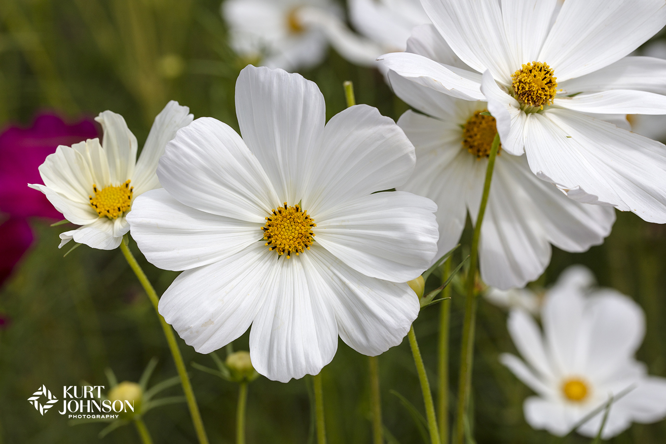
But as I started looking through my image library, I began to realize how versatile Viva Magenta 18-1750 is. Hints of it showed up everywhere:


. . . in flowers, succulents, feathers, landscapes, and grasses.
It was woven into the stunning transition of autumn leaves and sprinkled in a pond of lilypads.

Even on Pantone’s website, rather than using a standard one-tone color swatch, Viva Magenta is displayed as a diverse color with depth, represented by multiple shades and textures – tying into Pantone’s vision of a color palette “inclusive of all.”

And while red is not a common choice in healthcare settings, the bold and playful echoes of Pantone’s Viva Magenta, with its deep connections to pink and purple, give it a dramatic versatility that acts as a bridge between the digital and natural world.
Leatrice Eiseman, Executive Director of Pantone’s Color Institute describes Pantone’s Viva Magenta as representing this balance in 2023:
“In this age of technology, we look to draw inspiration from nature and what is real. PANTONE 18-1750 Viva Magenta descends from the red family and is inspired by the red of cochineal, one of the most precious dyes belonging to the natural dye family as well as one of the strongest and brightest the world has known.”


One way we’ve already been creating this bridge between the digital and natural worlds for healthcare environments is through the use of vector graphics.
Vector graphics, like the images seen above, are an innovative way of creating this balance while still providing the benefits of using calming nature images in healthcare environments.
Vector graphics are interpretations of our images with a more stylized sensibility, maintaining photo realism but with unlimited scalability. This allows images to stretch down seemingly endless hallways without losing detail.
So combining Pantone’s Viva Magenta with the adaptability of vector graphics is a win-win.


“Viva Magenta is brave and fearless, and a pulsating color whose exuberance promotes a joyous and optimistic celebration . . .” -www.pantone.com

Pantone’s Viva magenta is multi-faceted.
It can make a splash in a playground of reds, delve into the land of purples, or linger somewhere in between.
And many of our images can be easily manipulated to match any color palette, giving you the flexibility to get the perfect color for your specific vision.


We even found hints of Viva Magenta in these gorgeous orange calla lilies.
And that’s part of the fun, uncovering the unexpected places where Viva Magenta already exists or finding the ways it can bring out the best in other colors, like when it shows up in a supporting role.
No matter how Pantone’s Viva Magenta shows up, it’s hard to look away. And that’s what makes it a great choice for 2023.

To learn more about previous Pantone Colors of the Year, check out:
Not Your Grandmother’s Color of the Year – Pantone’s Very Peri
Categories: Color