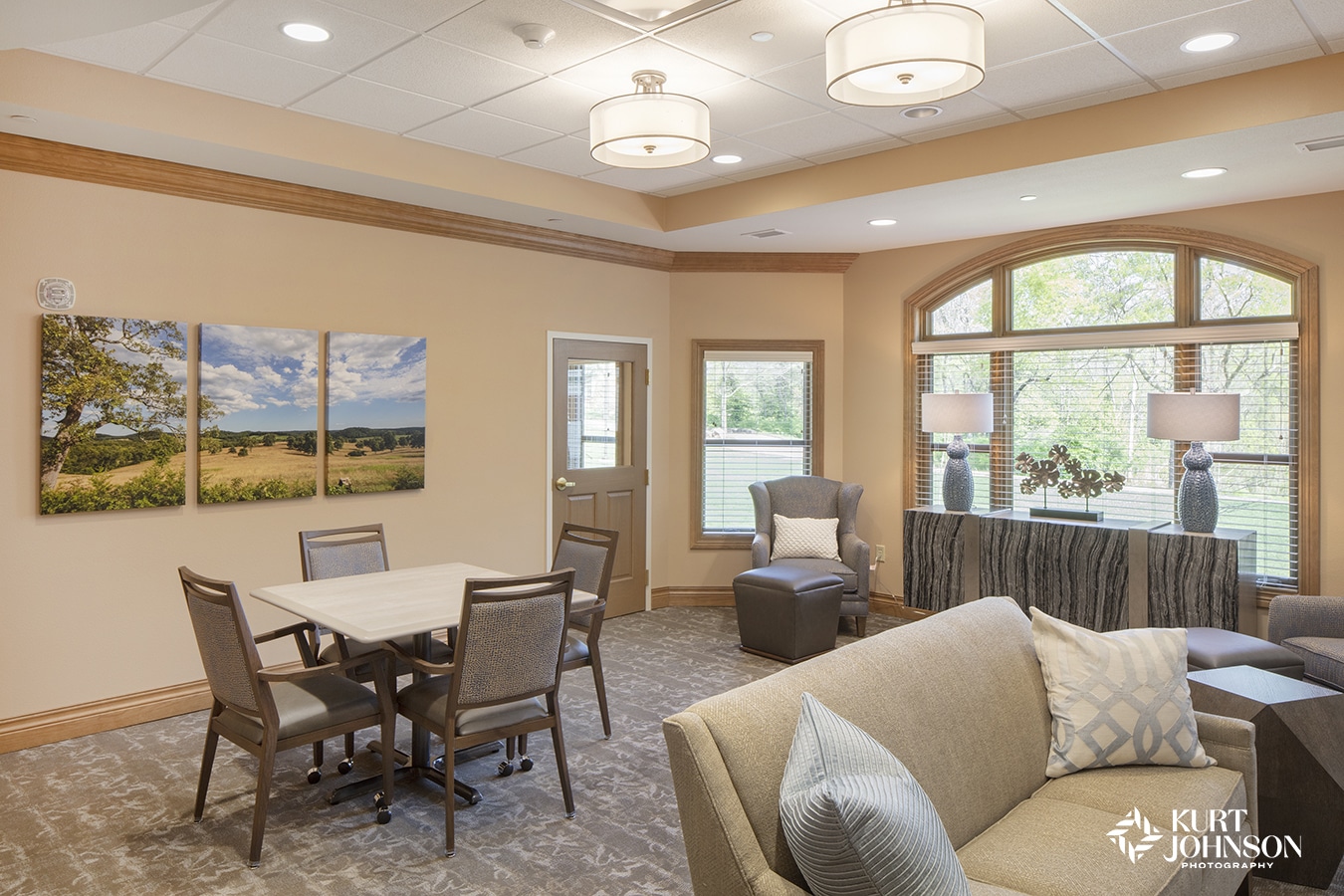
Still 2020. Revisting the Pantone Color of the Year.
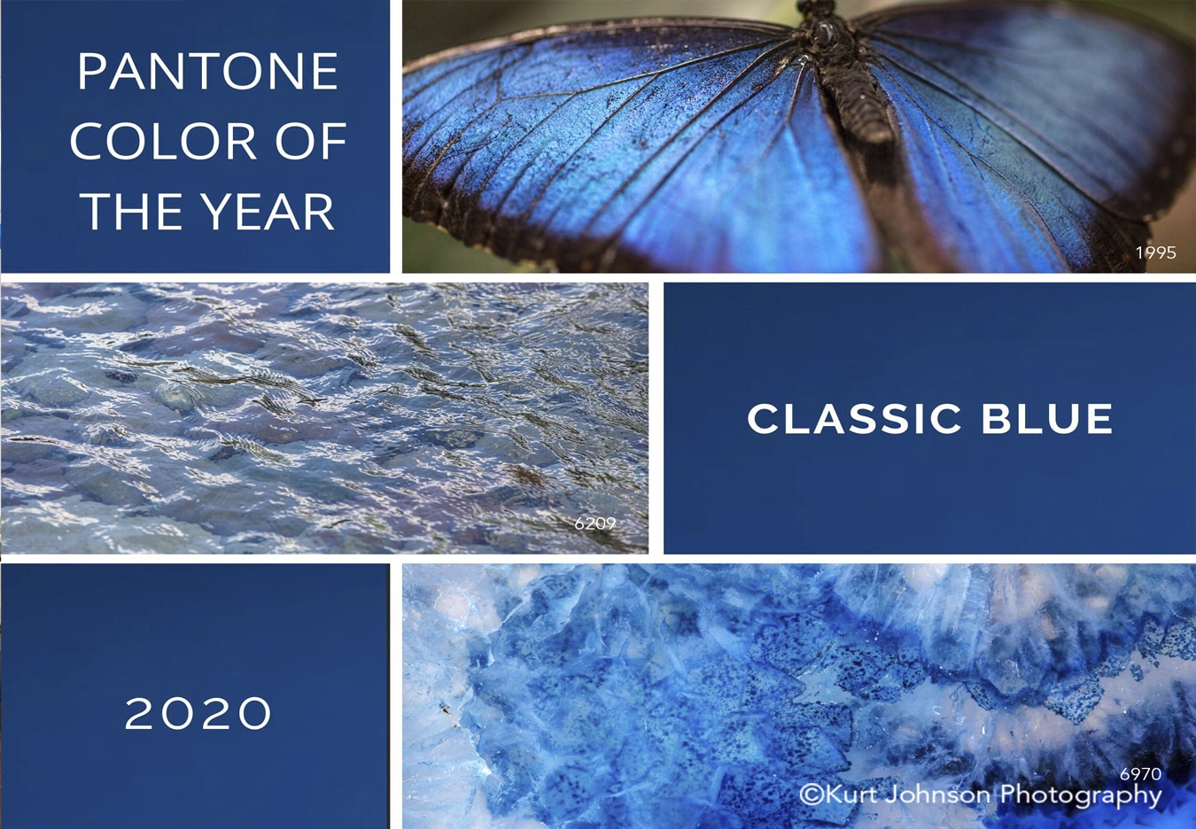
We are halfway through 2020 and I don’t think it’s an overstatement to say most of us are not in a place we expected to be. We have faced varying degrees of change and uncertainty this year, and no one has seen this more than our healthcare community.
As we all look for ways to incorporate more calm and certainty in our day to day lives, I think it’s interesting to look at Pantone’s Color of the Year, which was announced long before the current climate.
“PANTONE 19-4052 Classic Blue brings a sense of peace and tranquility to the human spirit, offering refuge. Aiding concentration and bringing laser like clarity, PANTONE 19-4052 Classic Blue re-centers our thoughts. A reflective blue tone, Classic Blue fosters resilience” (From Pantone’s website).
I find myself drawn, not only to the beauty, but the resilience of the natural world time and time again. And often those things that call to me are varying shades of blue waterscapes, deep skies and pops of color filled with detail and texture.
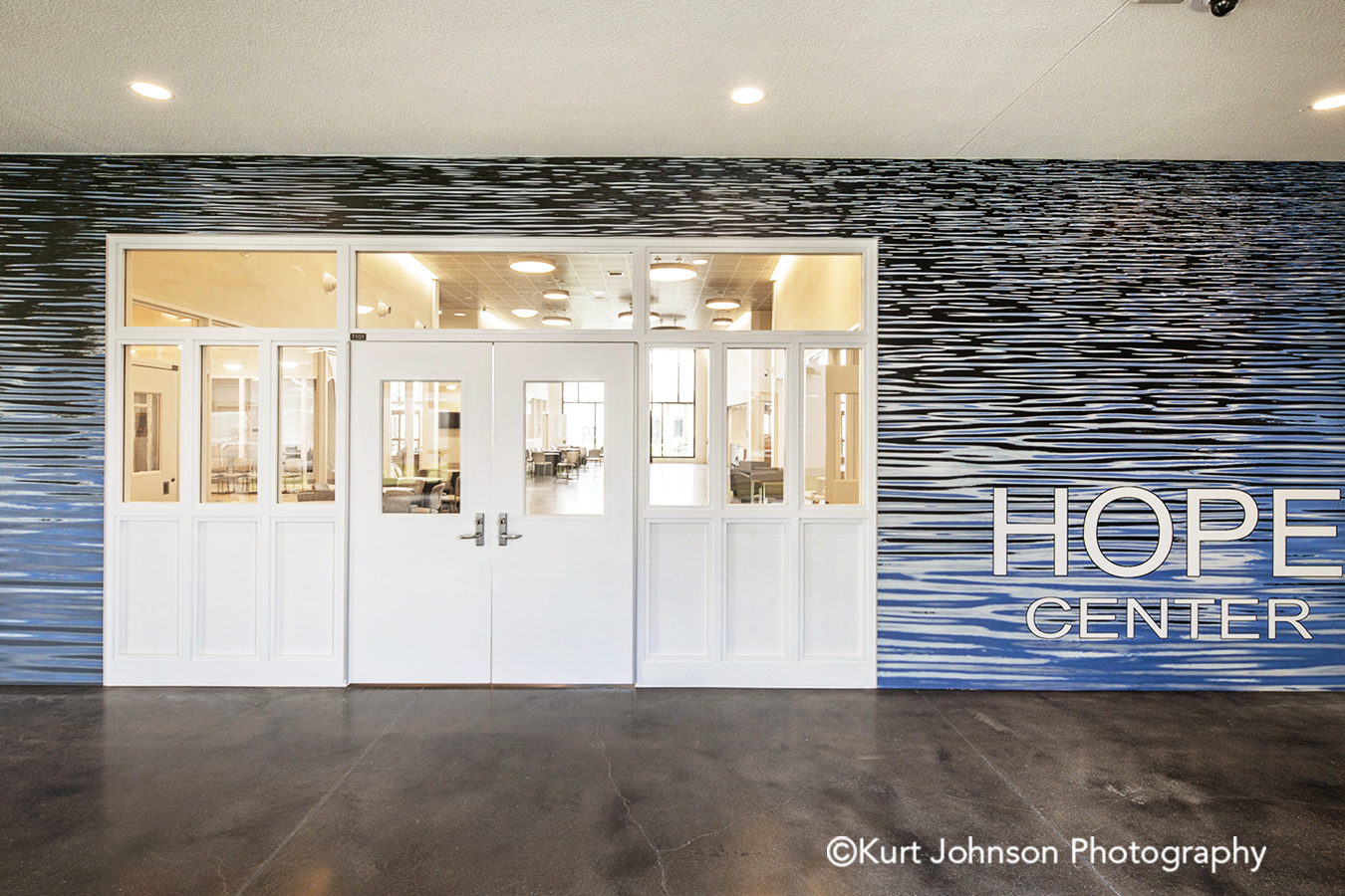
Research suggests nature art promotes restoration if it has certain characteristics, including calm or slow moving water (Ulrich, Gilpin, 2003). Images of water have already been a popular choice for healthcare settings, but the comfort those images can provide, in the current landscape, is more meaningful now than ever.
Here are 5 examples of subjects that will allow you to incorporate blue into a space as a means to create a more soothing and peaceful environment:
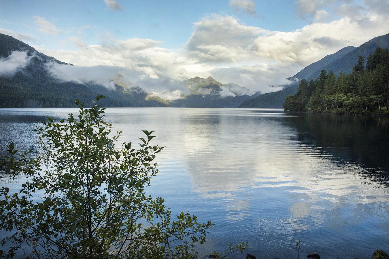
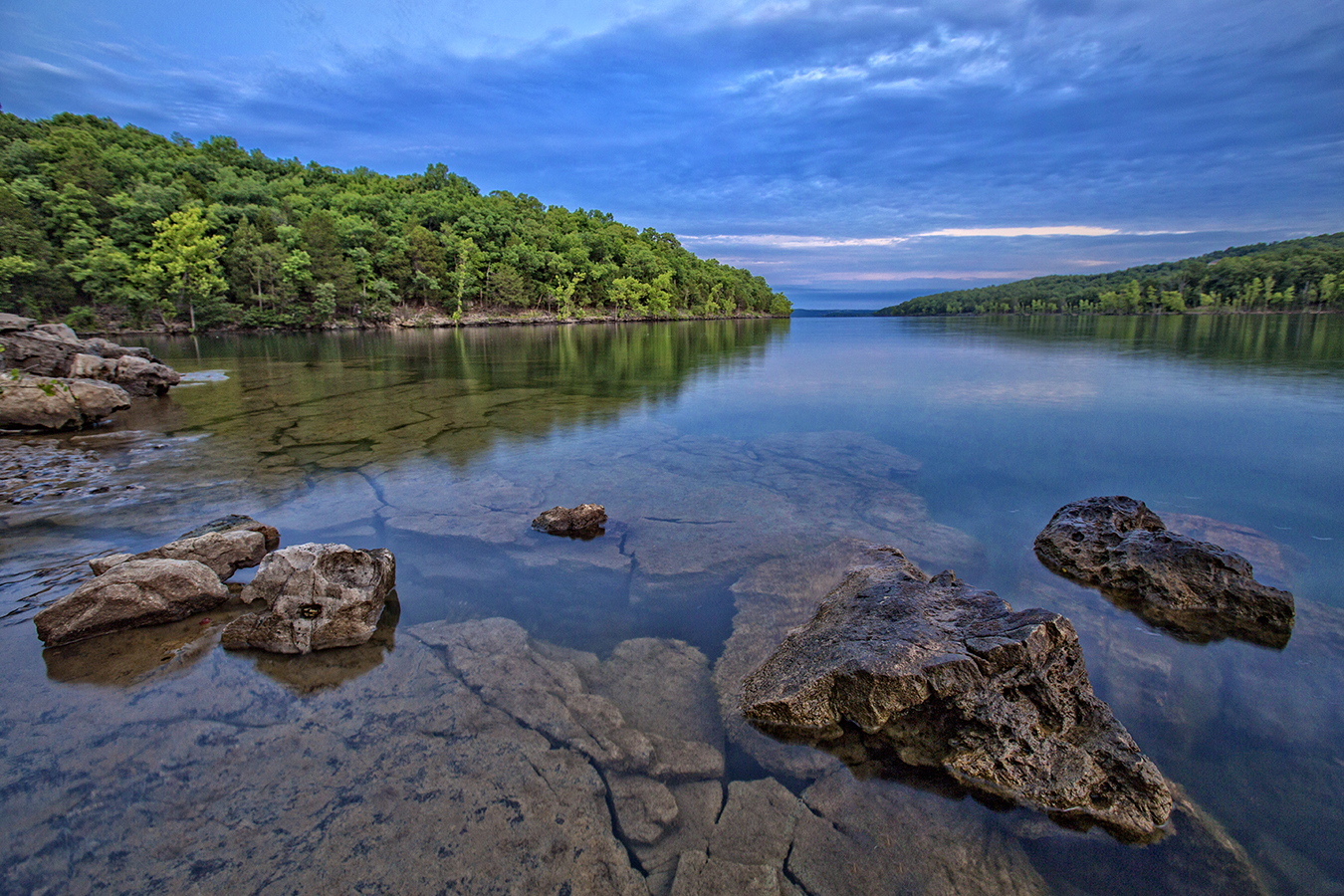
1. Water – Water is the obvious choice based on the research referenced above. Water makes up approximately 60% of our bodies and covers almost 3 quarters of the earth’s surface. We can’t live without it, so it makes sense we would want to surround ourselves with images of calming waterscapes when we’re not able to be out in nature.
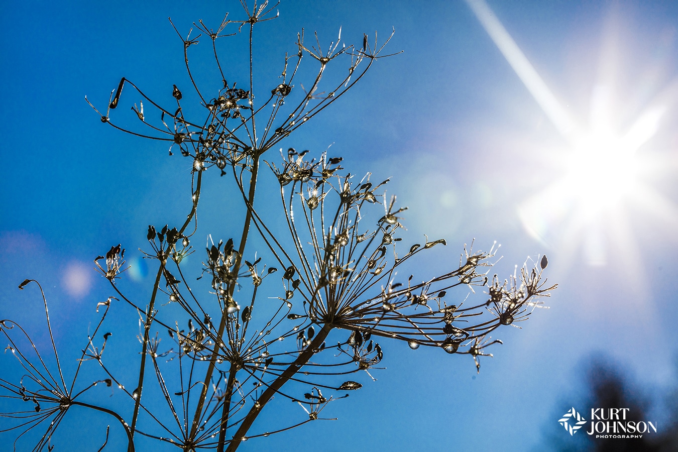
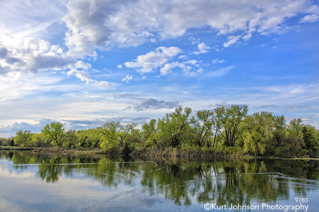
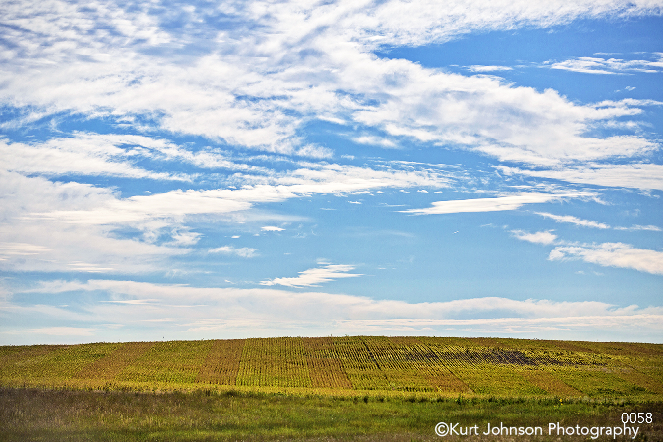
2. Blue skies – Nothing says hope like the open road and a widescreen view from the driver’s seat of a vast blue sky ahead. Couple that with a new study by paper manufacturer G.F. Smith which found dark blue is the color most associated with relaxation, and you’ll probably begin to understand the potential of blue imagery to transform healthcare design and positively impact patient outcomes.
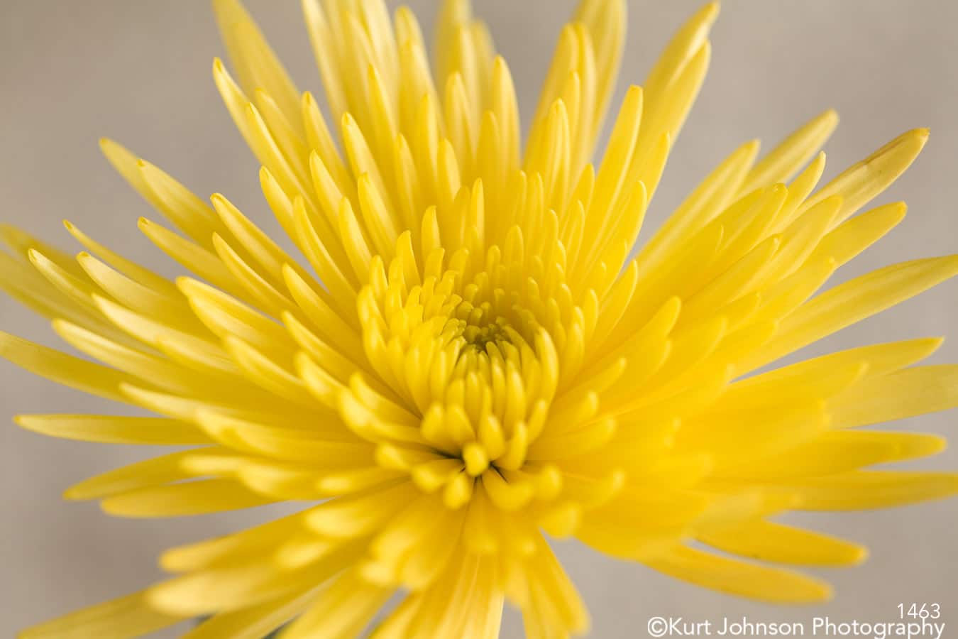
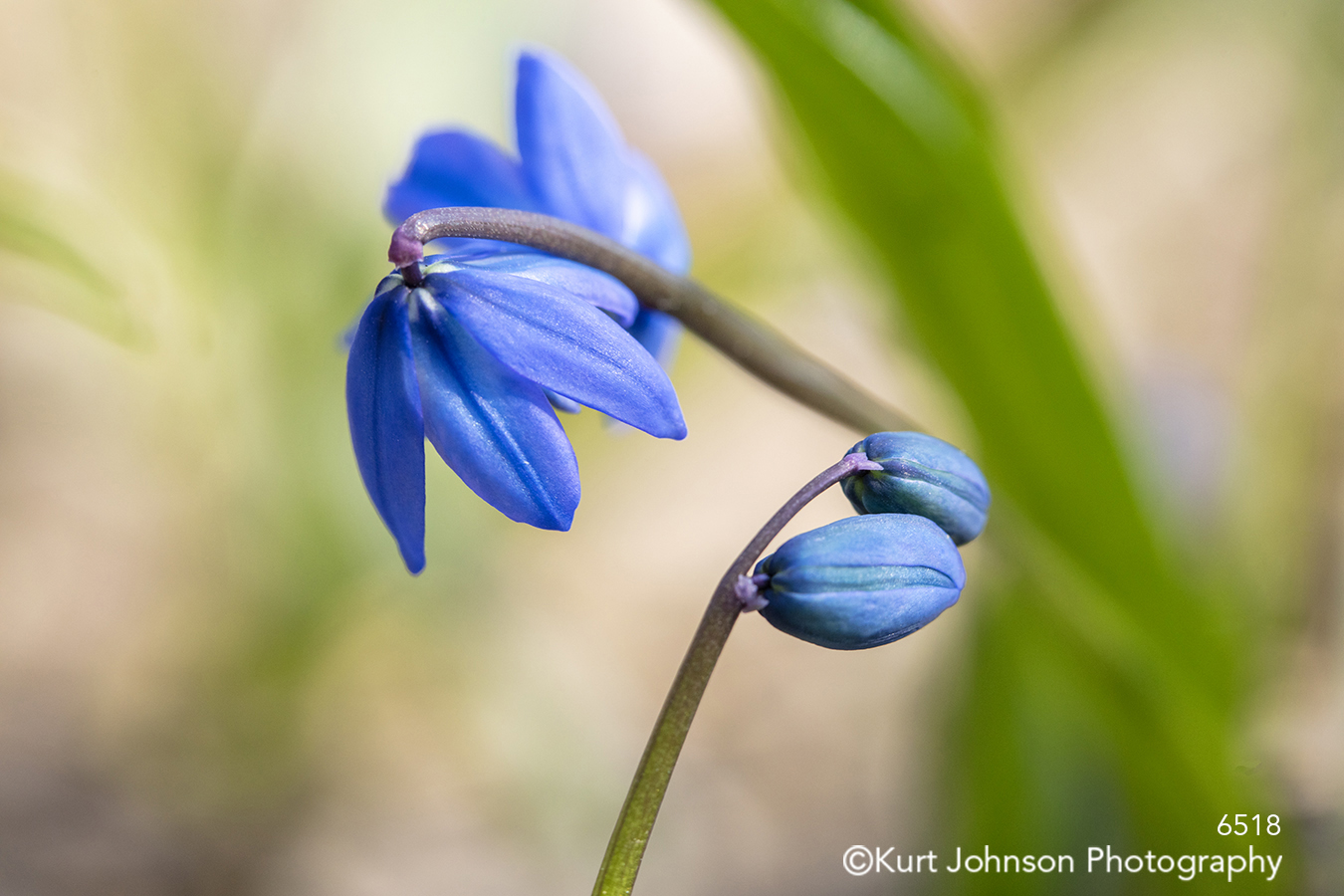
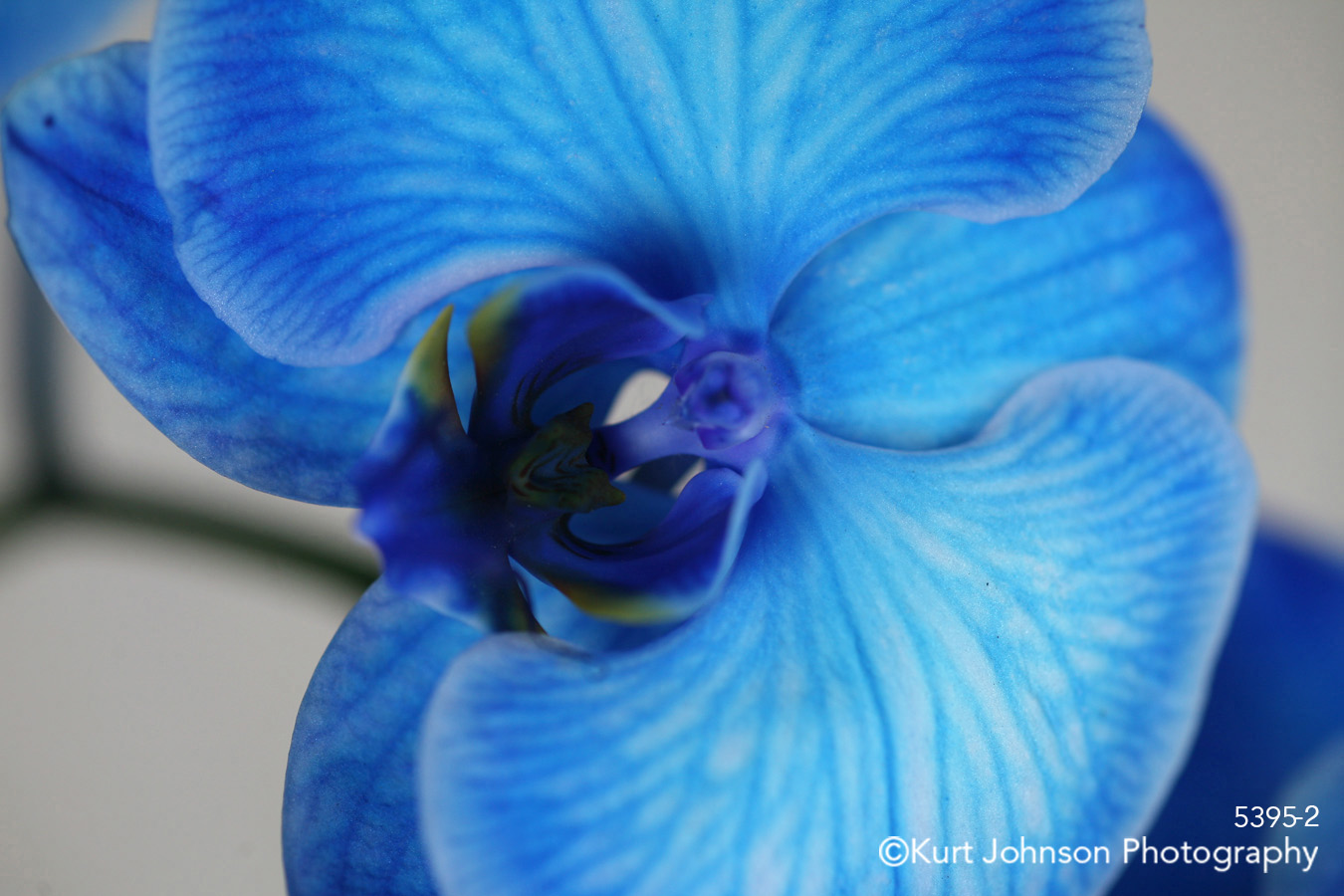
3. Flowers – Blue flowers are rare in nature, but I’ve captured a few and have even altered some to match clients’ specific color palette. Flowers are a perfect way to highlight nature’s awe-inspiring beauty.
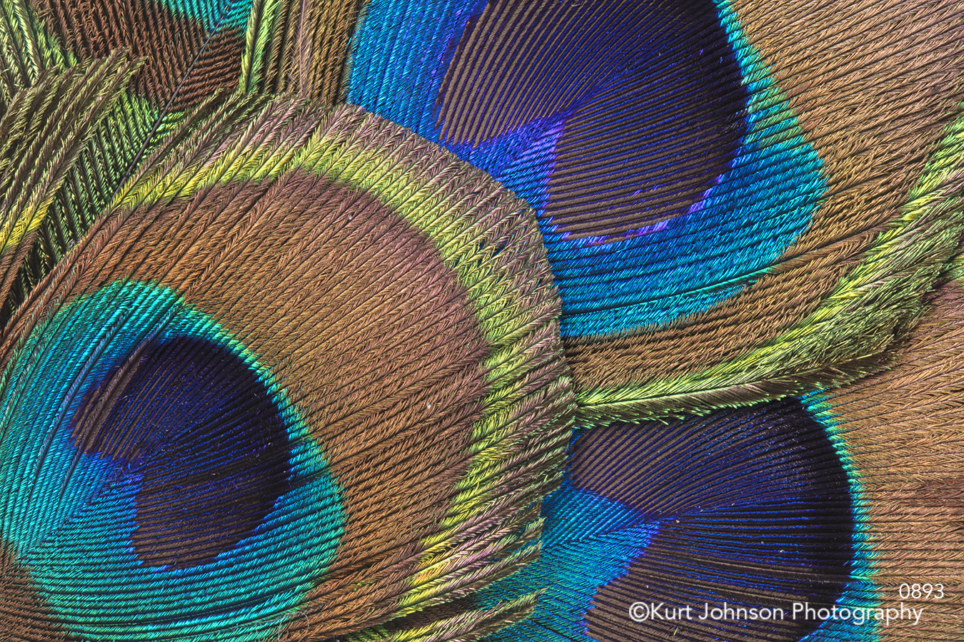
4. Textures – You can find blue details in all corners of nature, including agates and feathers. Textures make for unique and modern subject matter when you’re looking for images that will stand out and demand attention.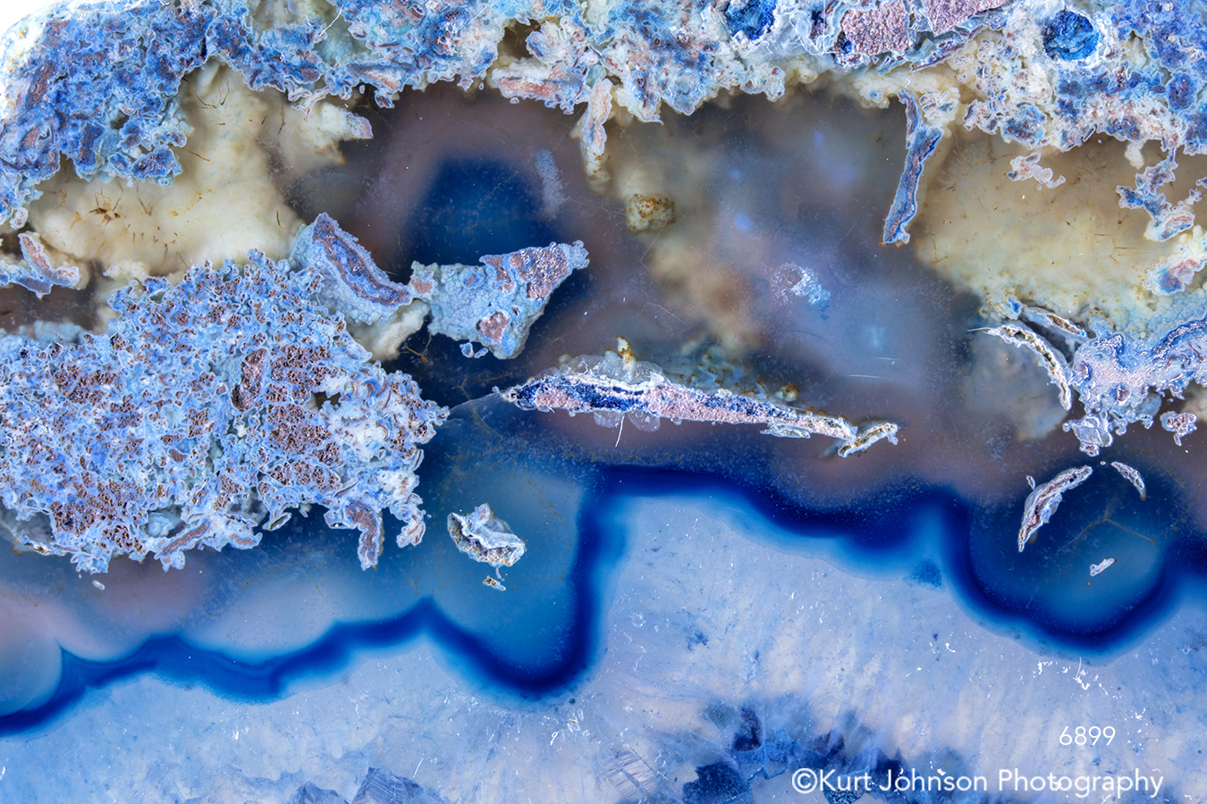
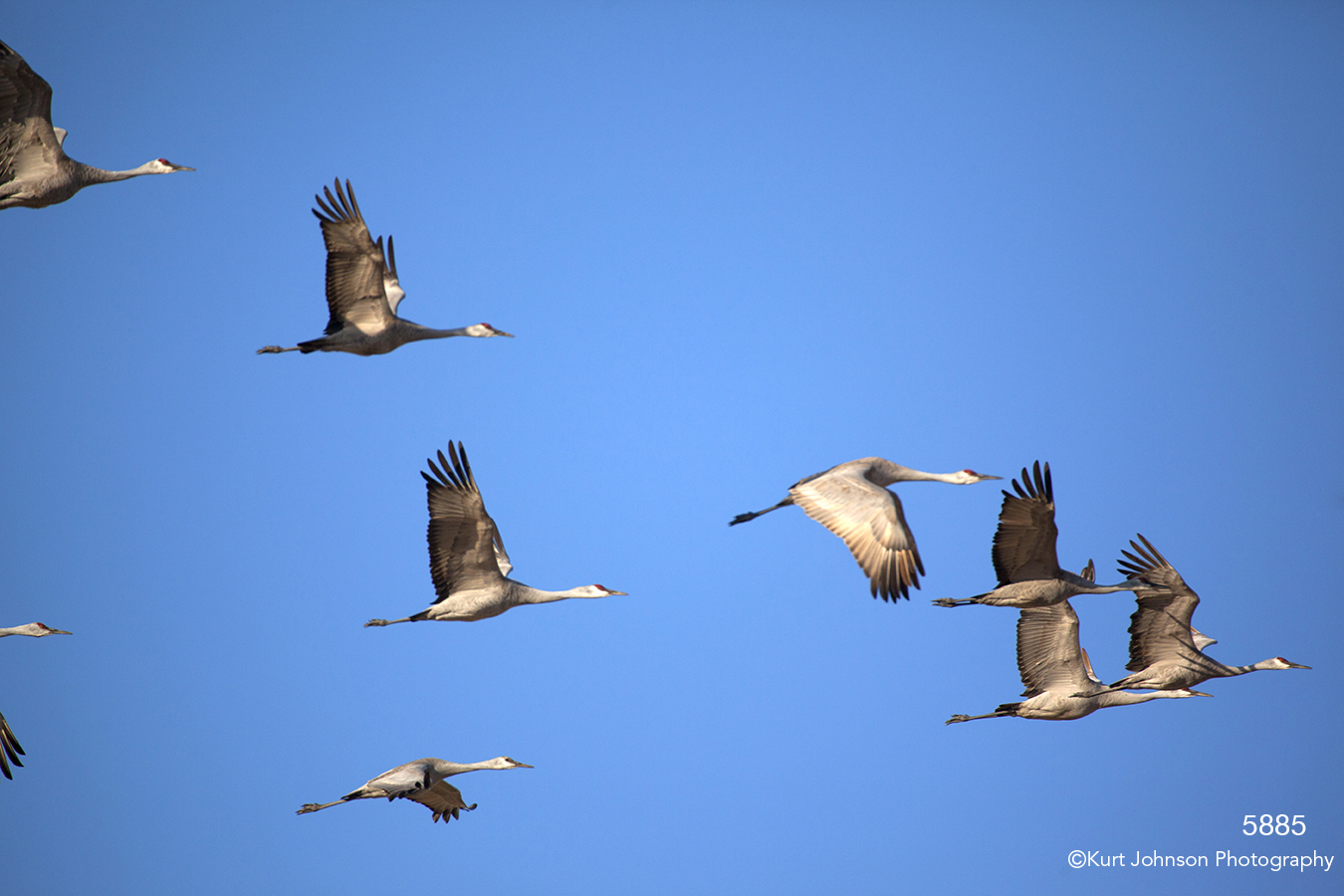
5. Wildlife – Sometimes it’s the background color that makes the subject stand out. In these images, a blue sky takes a backseat to nature’s wildlife, and yet the bold splash of blue sky is what makes both images so powerful.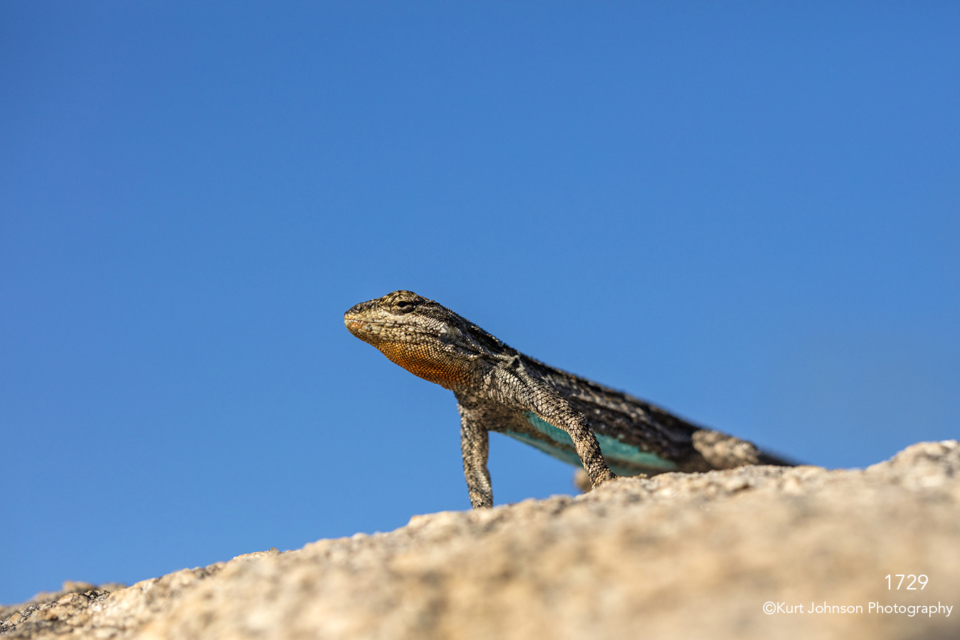
You can see more of my blue nature images here and be sure to check out this short, relaxing visual meditation on the color blue:
Categories: Color, Healthcare
