Is Pantone’s Mocha Mousse the Color Healthcare Environments Have Been Waiting for?

In healthcare environments, color choice goes beyond aesthetics. Color impacts mood, energy, and even recovery. That’s why hospitals and wellness environments need to be intentional when it comes to color choice, considering the impact on patients and staff. And while many colors have a soothing impact on the entire care team, is PANTONE 17-1230 Mocha Mousse the color healthcare environments have been waiting for?

The color brown is often associated with healing because of its connection to nature. Think about tall grasses, soil, the intricate brown patterns in the center of many wildflowers, or the base of any tree. Brown is a color that helps you feel grounded and connected to Earth, fostering a sense of stability and balance crucial for emotional and physical healing.

Considered “rich and classic . . . representing simplicity, naturalness and wellness,” brown evokes feelings of comfort, warmth and security” (https://www.colorpsychology.org/brown) – all characteristics that help make healthcare environments soothing places for healing and recovery.
The color brown “improves our lives by reminding us about the things that are most important – our connections to earth, home, family” (https://www.colorpsychology.org/brown).
And that was a big reason Pantone chose Mocha Mouse as their color for 2025. It’s a color that encourages us to appreciate the everyday moments in life.

What began as a way to mark the millennium in 2000, soon became an annual tradition for Pantone. The color of the year was designed to capture a snapshot of what’s going on in the world while looking ahead to a new year. Elley Cheng, Pantone’s President, describes the color choice as “A reflection of the moment that we’re living in.”

Brown evokes feelings of comfort, warmth, and security, creating calming environments that support the body’s natural healing process. It’s also a neutral tone, encouraging simplicity and relaxation by reducing sensory overload, which is helpful for healthcare environments wanting to create spaces to reduce stress and support healing.
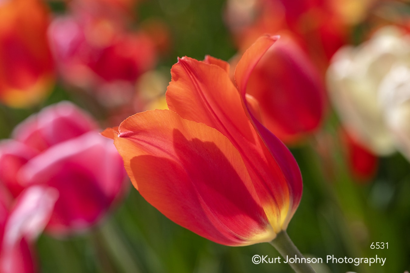
But Mocha Mousse can also be a compelling background color when paired with brighter shades, like orange, red, and yellow:

Orange –
Earthy brown paired with warm, uplifting shades of orange brings a sense of comfort that creates balance in healthcare environments.

Macro view of bright orange feathers. Photo by Kurt Johnson Photography.
Brown tones down the intensity of orange while orange adds a touch of brightness to brown.

Red –
Brown and red together create a healing environment by combining the grounding qualities of brown with the revitalizing properties of red.

This duo is common in nature – red soil, clay, and tree bark. These organic associations evoke feelings of being connected to the earth, which research indicates promotes recovery and healing.

Yellow’s warmth, positivity, and mental clarity uplift the spirit.
When paired with shades of brown, a harmonious balance is created, which results in environments that have the power to soothe and rejuvenate.

So can color really affect healing? We think so.
For the same reason many healthcare environments choose shades of blue because of its connection to water (research indicates blue supports restoration), brown has its own connections to the natural world, making it a color we connect with instinctually.
Anytime our connection to nature is enhanced in built environments, especially hospitals and other healthcare environments, the potential for recovery and restoration is increased.

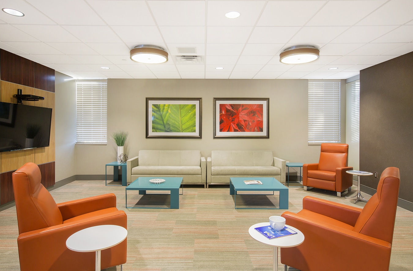
So how can you use Mocha Mousse to bring more healing into your environment? Whether it’s painted walls, artwork, wood surfaces, or cozy fabrics, mocha mousse is just one color in nature’s powerful palette of healing shades.
We agree with Cheng’s sentiment when describing Mocha Mousse: “This color isn’t just seen – it’s felt.”

Anytime a patient or staff member feels something when viewing a color or nature image, that’s a powerful design tool that should be harnessed.
As far as we’re concerned, when your design is backed by nature, you can’t go wrong.
Learn more about how color can transform your space here:
Categories: Color, Healing, Healthcare, Photography


