Is Red the Dark Horse When it Comes to Choosing Colors for Healthcare Environments?

We’ve written before about the importance of choosing the right colors for healthcare environments. And while blue is the go-to color for most hospitals and medical office buildings, (for good reasons considering its ability to soothe and calm) there isn’t a one-size-fits-all color for healthcare.
Which is why you’ll find lots extensive color palettes, style boards, and even Pantone’s annually-changing color of the year.
So let’s look at what might be considered the dark horse when choosing colors for healthcare environments – red.


Red is an intense, powerful color in nature and design; its mainly known as the color of passion and love.
It’s a bold color choice when you’re trying to make a statement.

Because it’s such a dominant color, it often works well as a focal point in an indoor space, as you can see above.
Adding red when designing is a quick way to create drama and engage the senses.

The layers of this vibrant peony coupled with the contrasting yellow and greens make this a compelling view for patients and staff.
Red evokes feelings of positivity.
In fact, according to Color-meanings.com, “seeing the color red can inspire us to take action. It holds the ability to lift our spirits and energize us when we’ve grown stagnant.”


Think about the stunning reds that appear in fall and the way so many photographers and nature enthusiasts chase the colors of autumn while they last. It’s invigorating to gaze upon all the daring shades of red.
Red trees usually only bloom for a short time, but the color is exquisite, demanding attention. Especially against the backdrop of a deep blue autumn sky.


All these things make including red when choosing colors for healthcare environments sound pretty good, right?
But, as we mentioned above, red isn’t for every environment. Like most things, you have to consider the specific environment you’re designing for. It’s common knowledge that the reason hospital scrubs are blue is to provide contrast for doctors performing surgeries (since blue is the opposite of red on the color wheel).
So operating and surrounding treatment rooms are not an ideal location for images of red flowers and trees.


And while red is a stimulating color for creative types, according to Building Design and Construction Network, red is usually avoided in environments treating, “neurological conditions or patients suffering from ailments such as post-traumatic stress disorder.”
In those environments, the stimulation of the color red can be overwhelming for people whose senses are already overstimulated.


On the flip side, the color red is recommended for patients with dementia, who benefit from the brain stimulus red provides. According to an article on Fohlio.com, red is believed to be energizing and encourage alertness.
The color red has also been found to be good for the aging eye, which yellows as it ages and requires more contrast and vibrancy. “Color brightness and purity perception diminishes. . .” as we age, according to the article, Design Principles to Accommodate Older Adults published by the National Library of Medicine.
This makes the color red a good choice for memory care centers and senior living environments.


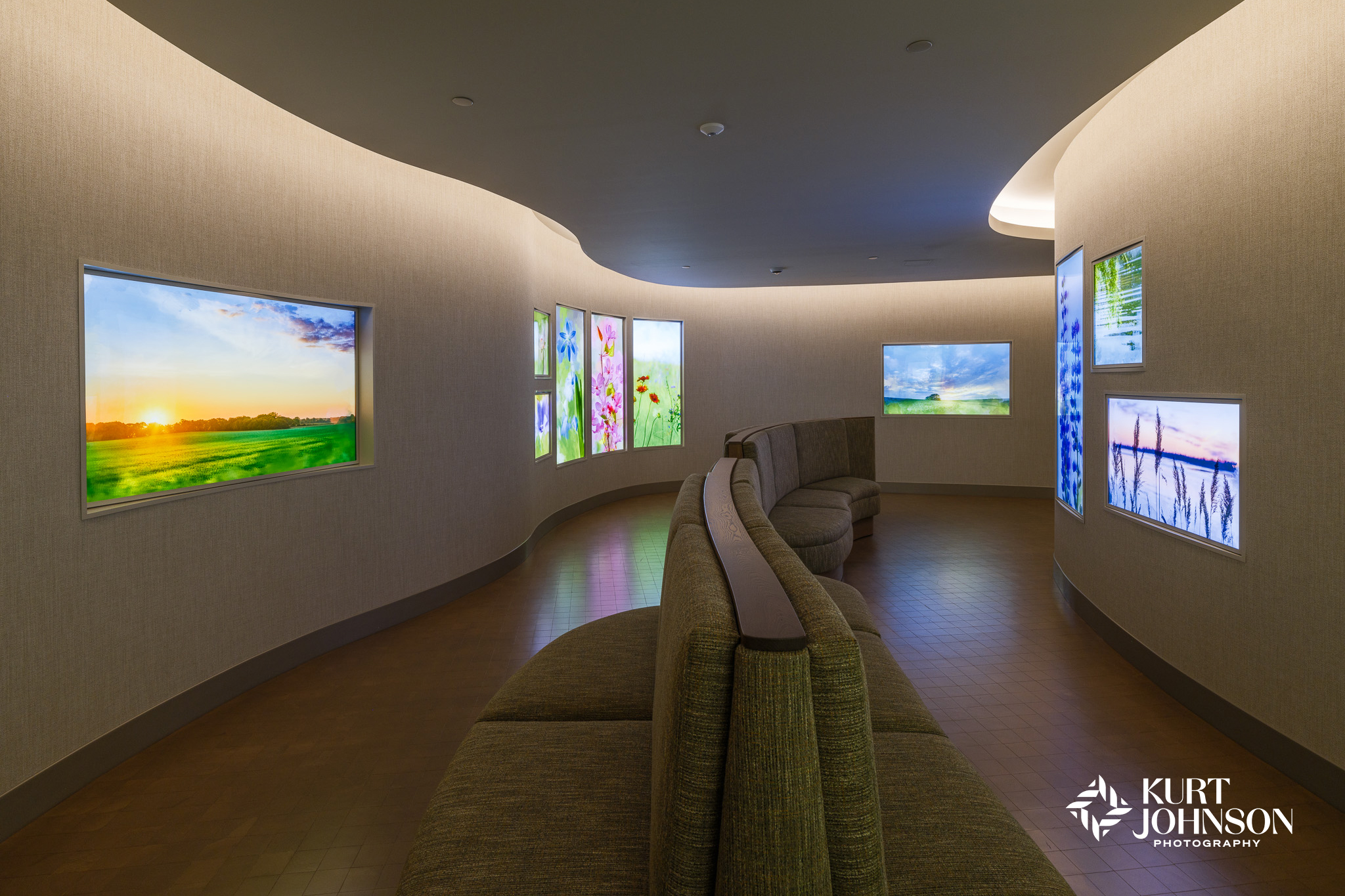
The art chosen for this installation at Nebraska Medicine’s Brentwood Health Center in La Vista is black and white, but it was chosen to compliment the red design accents in the flooring and furniture, which match UNMC’s well-known branding, prominent in Nebraska, and widely known throughout the US. Using the color red in this way makes the black-and-white images stand out.
So while red isn’t one of the most common colors for healthcare environments, it can be a powerful design element when used in the right space and shouldn’t be ruled out.
Categories: Color, Healthcare, Photography