Pantone’s Cloud Dancer: A Blank Canvas That Lets Nature Shine
As nature photographers working in healthcare design, we always look to Pantone’s annual Color of the Year for inspiration and to get a look at color trends from a broader perspective. It’s exciting to see how images from our portfolio match or complement the color chosen and how it ties into healthcare design overall.
This year’s selection, PANTONE 11-4201 Cloud Dancer, has sparked plenty of conversation. A white-based shade is an unexpected choice compared to Pantone’s typical bold declarations (remember 2023’s sassy Viva Magenta or 2022’s Very Peri?). For us, that’s part of what makes it worth examining, especially through the lens of healthcare design, where color, contrast, and calm play important roles.
Looking at Cloud Dancer Through a Healthcare Lens
According to Pantone, Cloud Dancer is “a lofty white whose aerated presence acts as a whisper of calm in a noisy world.” The color carries a soft hint of blue, but overall, it presents as a clean, minimal white.
Whether someone sees this as inspiring, blank, refreshing, or simply “white” depends on the viewer. In healthcare environments, however, whites and soft neutrals already appear frequently across walls, flooring, and furnishings. That means Cloud Dancer naturally fits into conversations around contrast, clarity, and how artwork interacts with space.
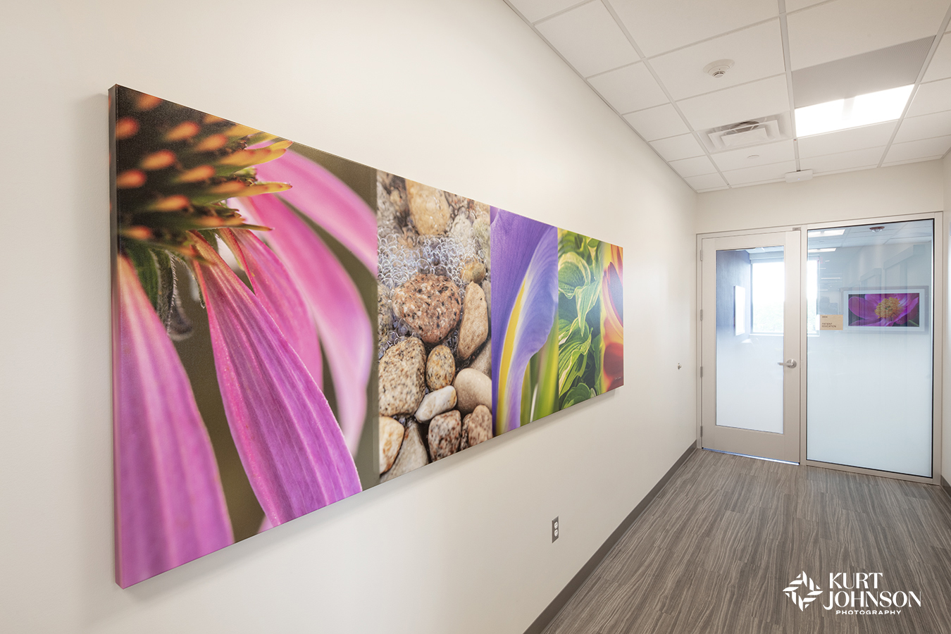
-
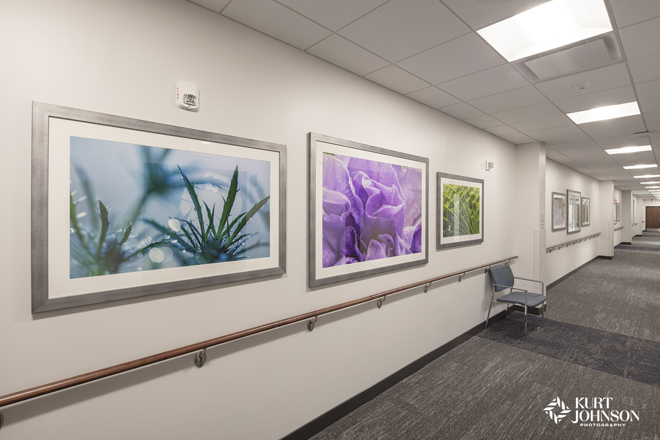
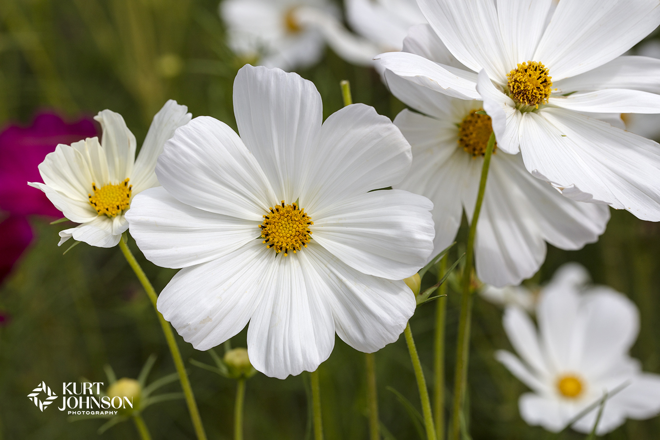
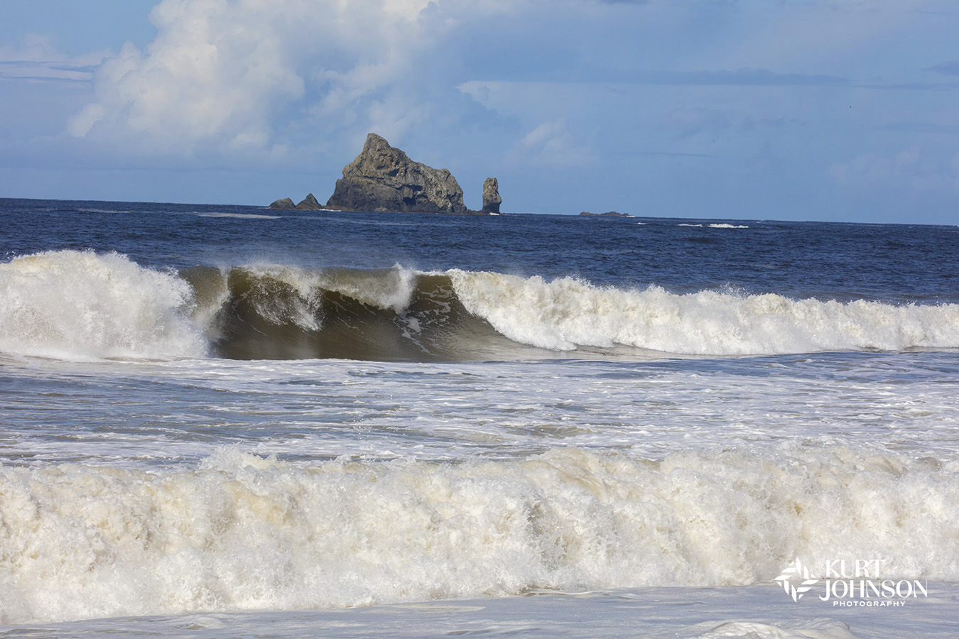
- Nature’s colors pop against a soft white wall at OrthoNebraska in Omaha.
-
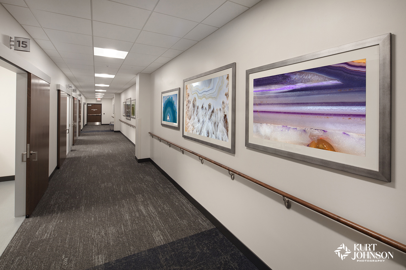
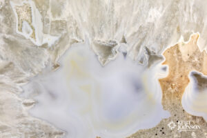
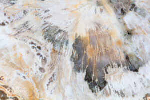
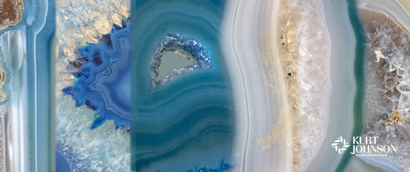
- Healing takes the form of bold agates against a calm, neutral backdrop at OrthoNebraska in Elkhorn.
Rather than viewing it as a color that defines a design direction, we see Cloud Dancer as a starting point – a neutral that allows other colors to do the heavy lifting.
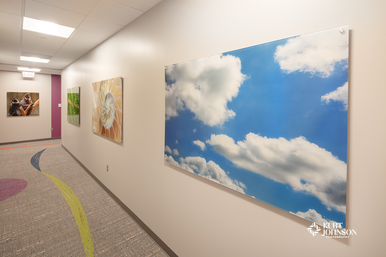
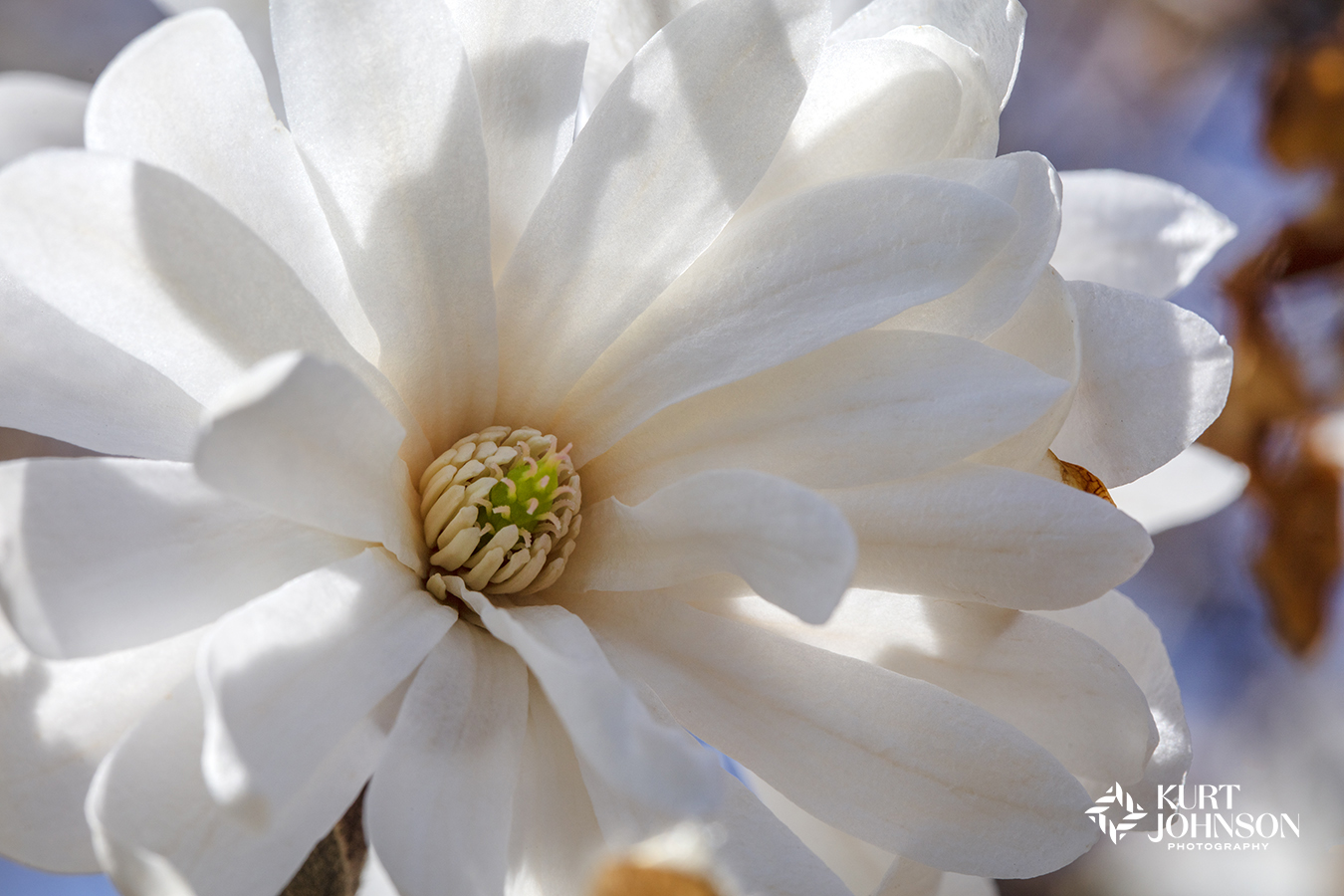
Vibrant nature images stand out on acrylic against a white backdrop in this Children’s Nebraska pediatrics facility in Omaha.
Why a Soft White Works as a Canvas for Nature Imagery
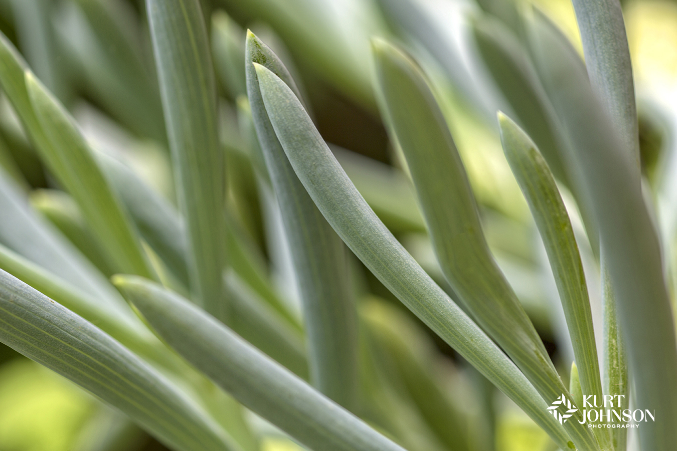
White can be many things: quiet, cool, clinical, clean, or simply present. In the context of nature photography, it often functions as a non-competing backdrop, giving the artwork full permission to take the lead.

Soothing corridor at Allina Health, Lakeville, MN.
When nature images, especially those involving bold blues, deep greens, or warm golden tones, are placed against a soft white like Cloud Dancer, several things happen:
- The eye moves directly to the image, not the wall
- Colors appear clearer, more vibrant, and more intentional
- Textures and details in the photograph are more pronounced
- The artwork becomes the focal point
This is particularly helpful in healthcare settings, where positive distraction is essential and visual clarity supports a calmer experience for patients, families, and staff.
Cloud Dancer doesn’t dictate a mood. It lets the artwork decide.
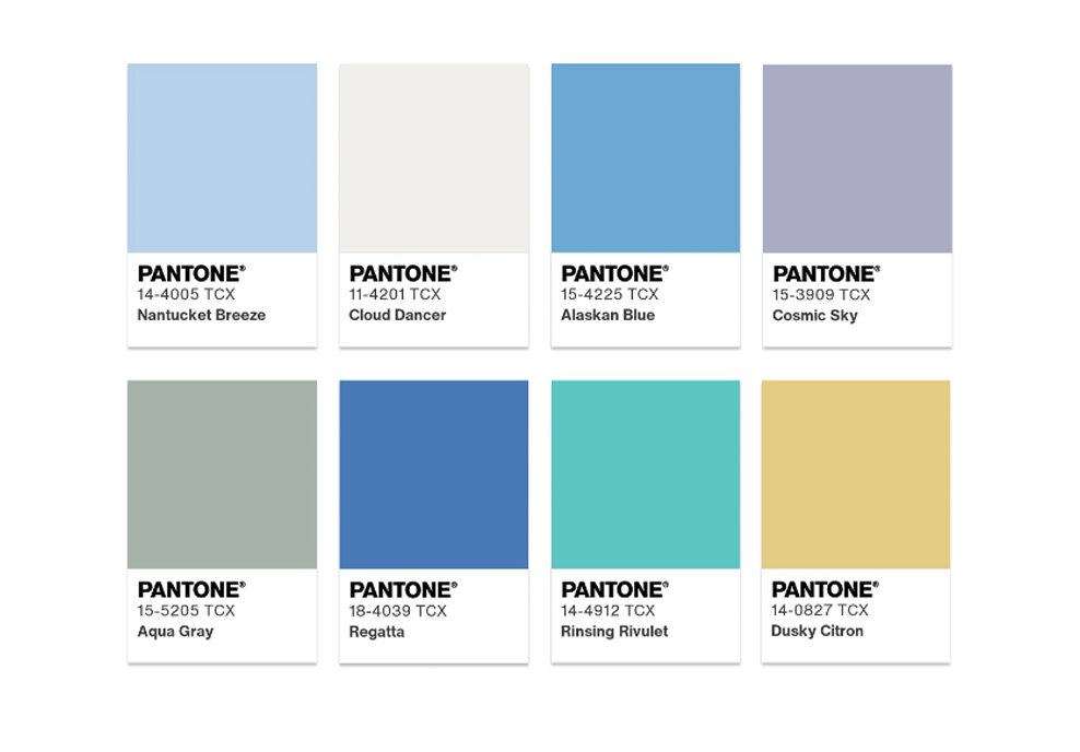
The Atmospheric Palette: A Helpful Reference Point
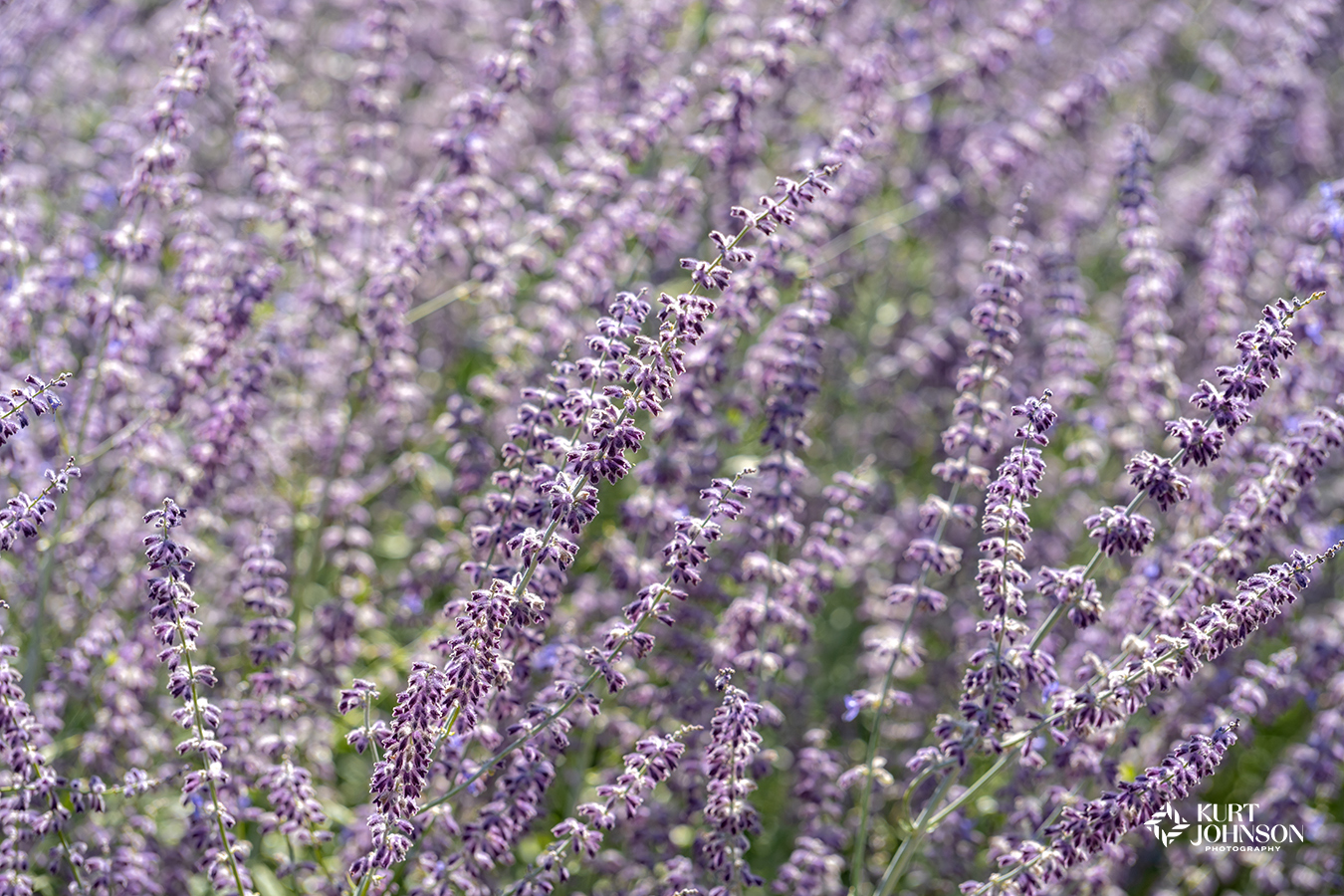
Alongside the Color of the Year, Pantone released companion palettes, including ATMOSPHERIC, a range of breezy blues, aqua tones, soft lavender, muted greens, and a warm dusky yellow. This palette stood out to us, not because it’s the “right choice,” but because its tones naturally echo the colors found in many of our nature photographs.
The palette includes:
- Nantucket Breeze – light blue
- Cloud Dancer – soft white with a hint of blue
- Alaskan Blue – medium sky blue
- Cosmic Sky – gray-tinted lavender
- Aqua Gray – sage-green gray
- Regatta – a more saturated blue
- Rinsing Rivulet – retro aqua
- Dusky Citron – a softened yellow
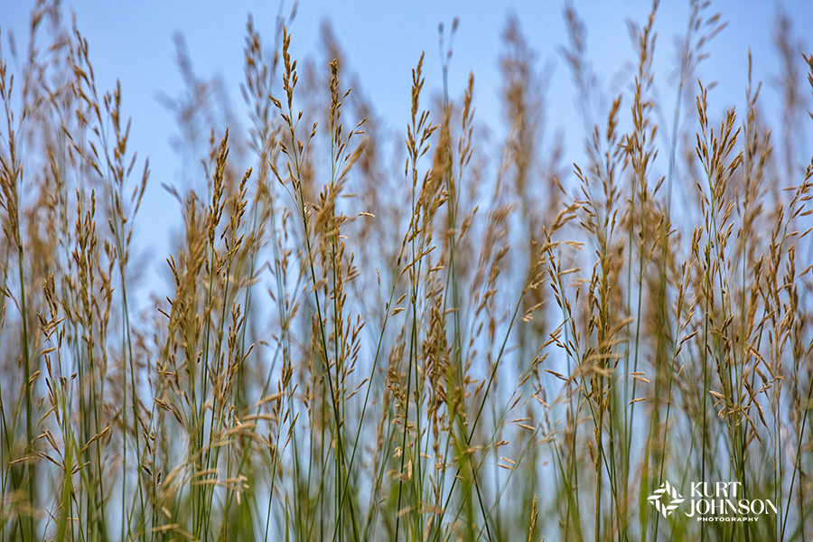
Blues and greens are well-researched for their calming, restorative qualities in healthcare, which makes this palette familiar territory. These colors are already common in evidence-based design, so seeing them grouped with Cloud Dancer show designers and healthcare executives how this year’s color might play an important, supporting role in healing. Cloud Dancer’s job isn’t to compete with these colors, it’s simply to hold space for them.
White as a Stage, Nature as the Lead
Whether or not designers choose to embrace Cloud Dancer is ultimately a matter of project needs, brand identity, and space functionality. Our interest lies in how this neutral white interacts with the nature imagery used to support healing environments.
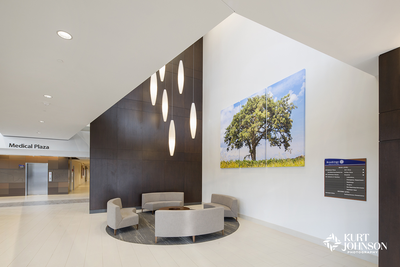
Lobby at Brookings Health System in SD.
In installations we’ve documented, white or light neutral walls often create the same effect Pantone describes: a crisp backdrop that heightens color, detail, and depth. The result is a moment of pause, a window to nature that stands out clearly and quietly, all in the name of healing and becoming part of the care team. In that sense, Cloud Dancer becomes less about trend and more about possibility.
Allina Health Mental Health & Addiction Specialty Center at Unity Hospital in Fridley, MN.
A Color That Supports Without Defining
As we look ahead to projects in 2026, Cloud Dancer is a reminder that sometimes the most understated shades can offer the most flexibility. Whether paired with deep blues, soft aquas, or warm natural light, this quiet white allows nature photography to do what it naturally does best: bring clarity, calm, and connection to the spaces where people need it the most.
Cloud Dancer doesn’t steal the scene. It lets nature shine (for all the right reasons).
Categories: Color, Healing, Photography


