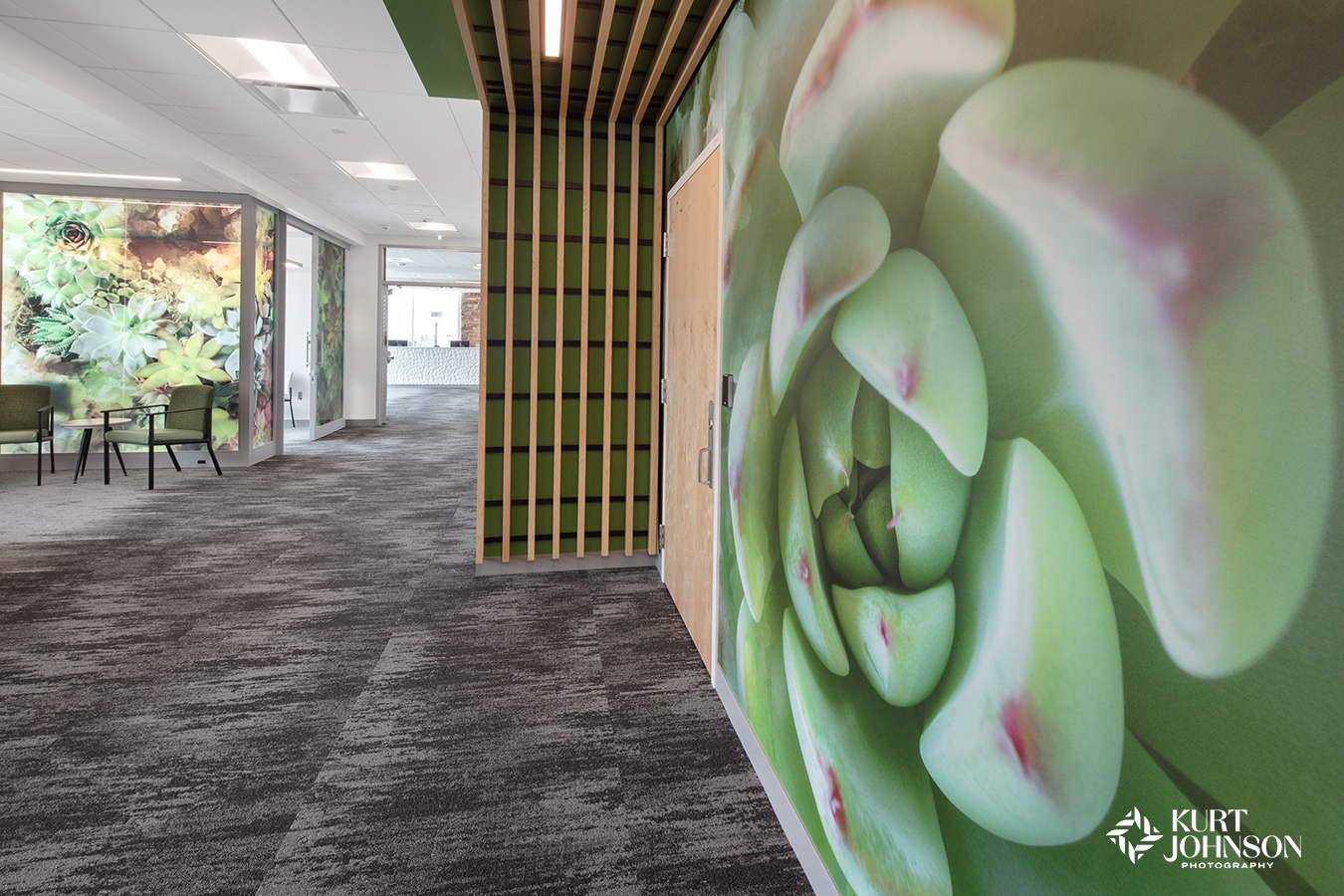
How to Put More Healing Power in Wayfinding
“I know exactly where I’m going.”
– said no one in healthcare ever.
Let’s face it. Healthcare environments are often large, complex buildings with multiple floors, wings, and departments that are easy to get lost in. And while there are lots of benefits to having so many services in one place, no one likes getting lost. Add that to the stress many patients are already feeling, and it creates even more anxiety.
According to an article on fiercehealthcare.com, “Problems with hospital navigation can lead to lower patient experience scores, more staff time spent directing visitors, and, ultimately, decreases revenue.”
That’s why so many healthcare facilities are looking for new ways to implement effective wayfinding.
What if a certain type of wayfinding could provide even more benefits to patients and the entire care team? Benefits like:
- Reducing anxiety and stress levels
- Lowering blood pressure
- Lowering the need for pain medications
- Serving as uplifting, positive distractions
- Increasing patients’ trust and confidence in their caregivers
- and even decreasing the length of hospital stays?
Not bad, right? Getting results like these can be easier than you think and part of an effective wayfinding strategy by incorporating nature photographs into the design.
Research supports that incorporating nature photographs into healthcare environments is a powerful way of providing comfort and healing to patients from the moment they walk through the door. And this was the thinking behind Allina Health’s recent refresh of United Hospital in St Paul, MN.
Allina designer, Monica Albertson, created a wayfinding strategy combining bold colors and nature photographs to distinguish different areas of the hospital. This simplified navigation while incorporating biophilic design to improve outcomes.
And while other areas of the hospital are still being redesigned, we’re going to look at how paint colors and nature photographs transformed floors 2, 3, and 4 into soothing environments that minimize confusion while decreasing stress and improving moods.
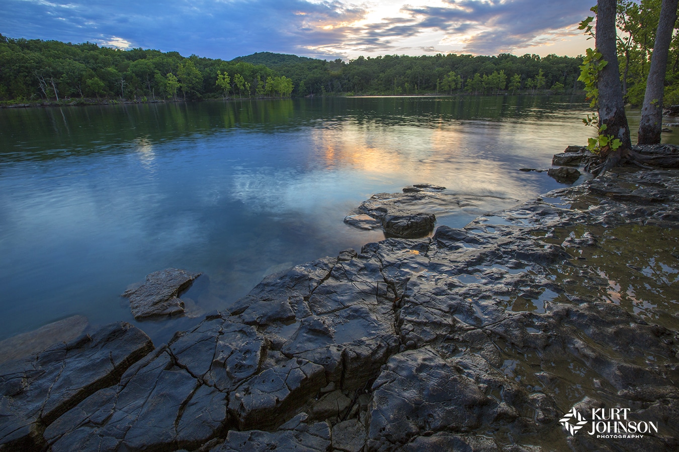
Level 2: Blue
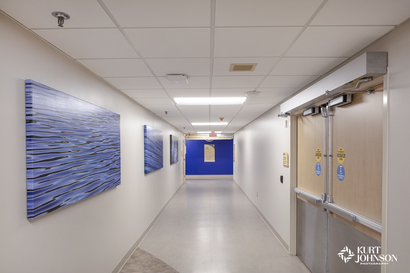
The 2nd floor of Allina’s United Hospital is centered around the color blue.
Blue is a calming color associated with water. Paper manufacturer G.F. Smith conducted a study finding dark blue is the color most associated with relaxation. As humans, our connection to water is essential for survival and provides us with a sense of calm and tranquility.
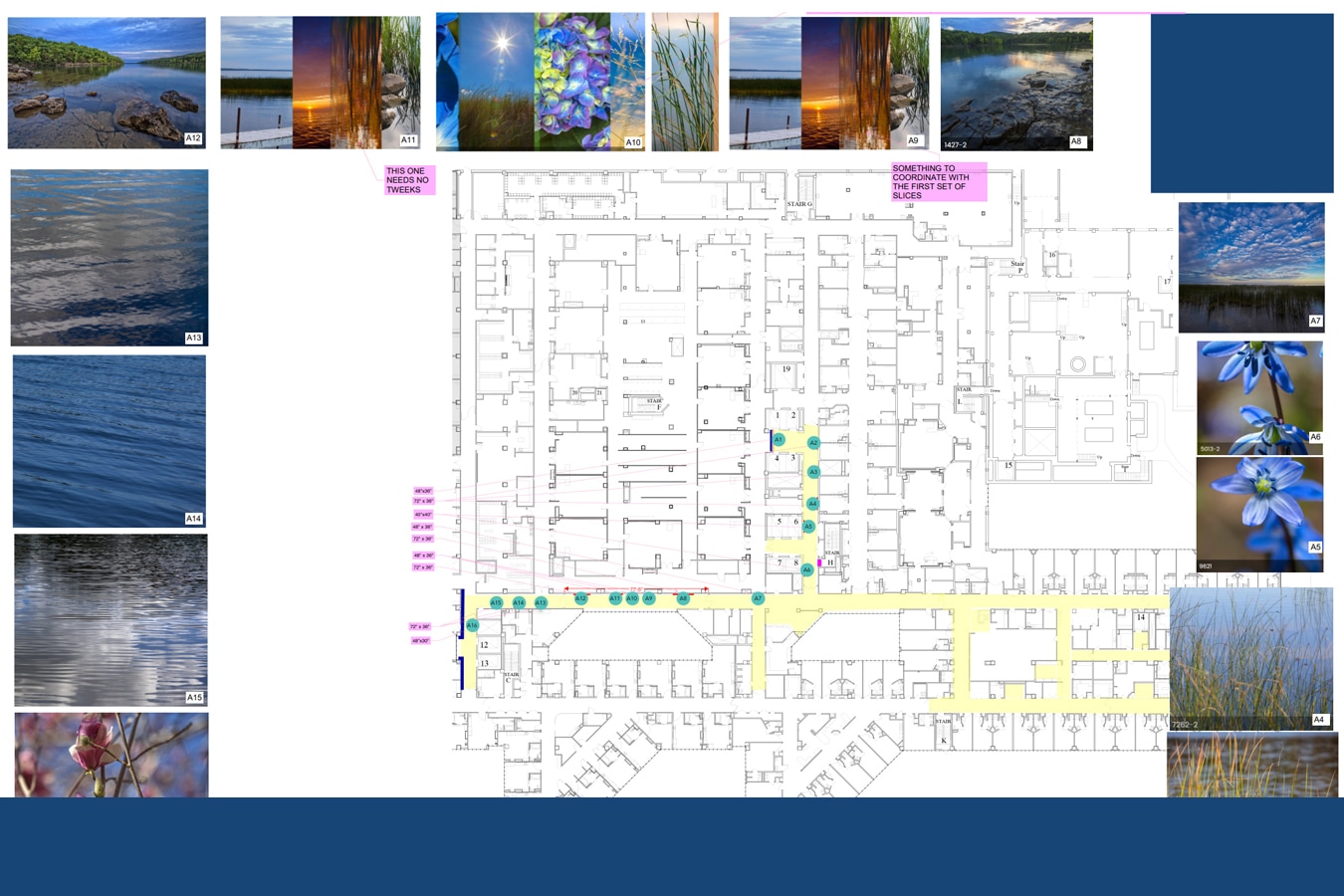
Calm, slow-moving water imagery makes healthcare patients feel more at ease and lowers heart rates.
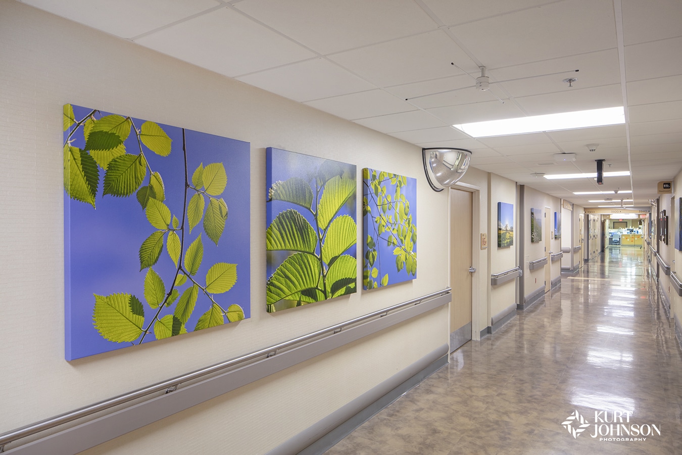
Level 3: Green
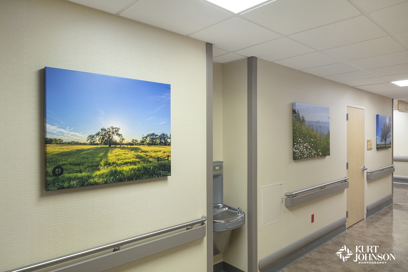
The 3rd floor uses the color green to separate it from other levels of the hospital.
Green is a great choice for healthcare because of its deep connection to the natural world. Green creates balance and harmony and enhances feelings of freedom and space.
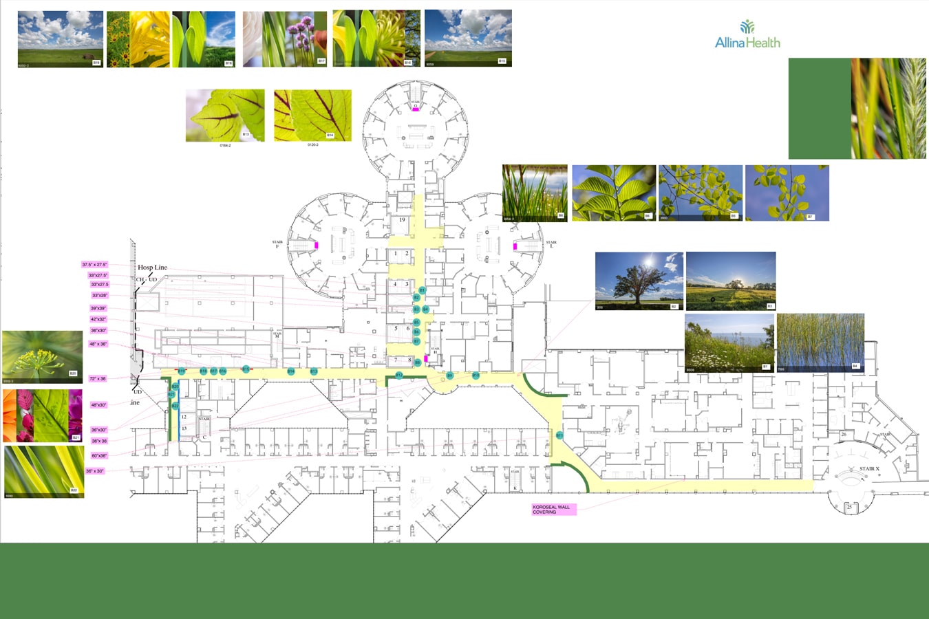
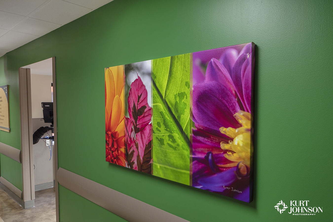
- Color slice created for Allina Health by Kurt Johnson Photography.
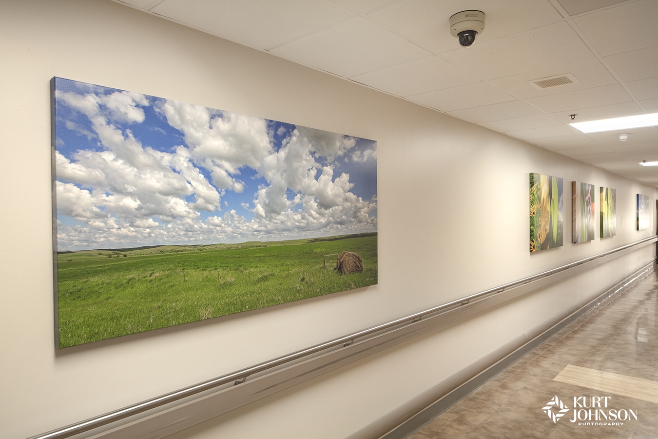
Landscape images have been shown to be some of the best types of photographs for healing.
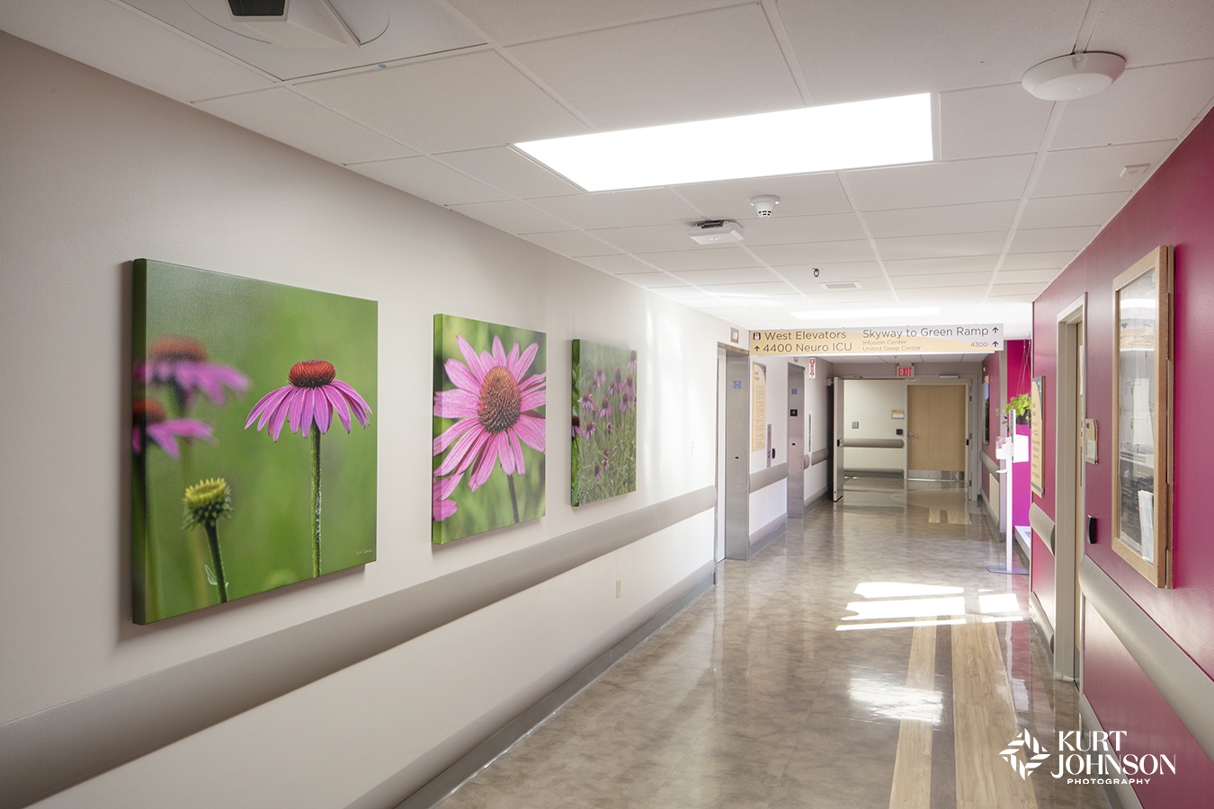
Level 3: Pink

The 4th floor uses pink, an uplifting color, to provide hope and wayfinding to patients and staff.
Pink is known to signify good health and success (color-meanings.com), making it a perfect color to promote healing and wellness in this healthcare environment.
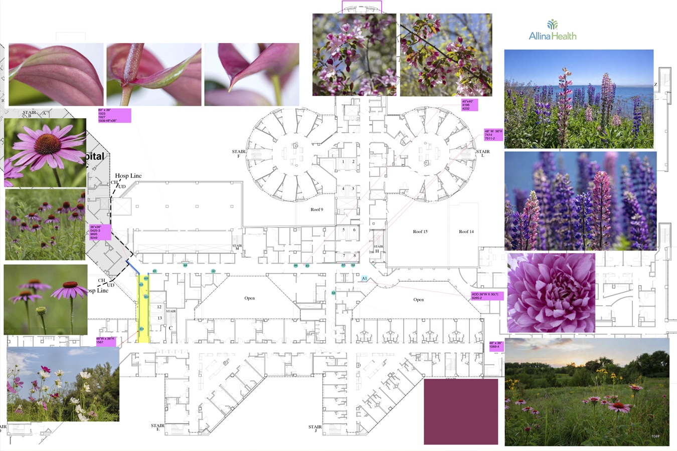
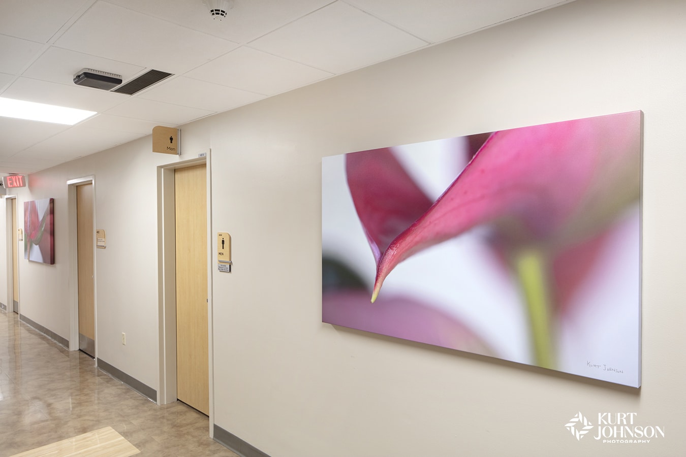
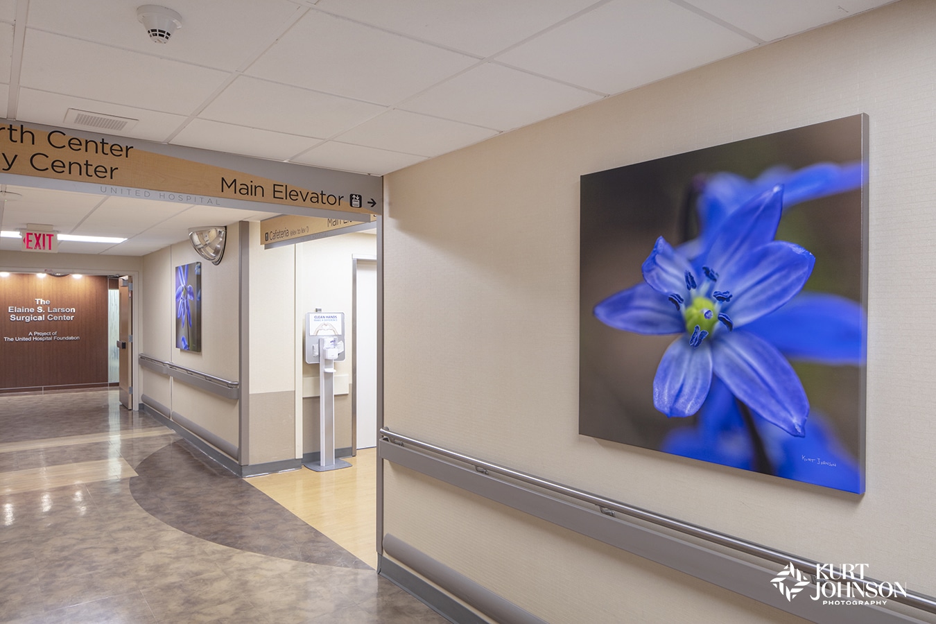
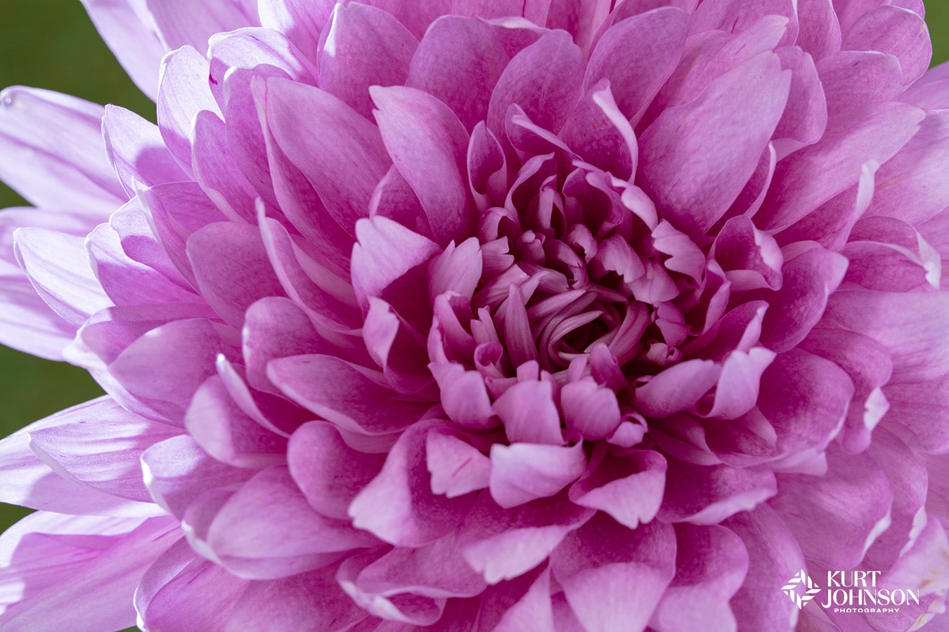
Thriving, healthy flowers are one of the primary subjects for healing with art according to a study by researchers Ulrich and Gilpin (Healing Arts: Nutrition for the Soul 2003), and it’s easy to see why.
Wayfinding is crucial in healthcare environments to help patients and visitors navigate complex buildings and easily find the care they need while minimizing stress and anxiety.
By making nature imagery part of the wayfinding design, you can offer patients and the entire care team an environment that’s easy to navigate AND yields the many healing benefits nature photographs provide.
Categories: Color, Healthcare, Installations


